Laura's Favorites

The Colors I Use Over and Over

I'm Laura, a designer in San Francisco who focuses on graphic design of physical spaces, such as office lobbies and museum exhibits.
These are the Benjamin Moore colors I keep coming back to, photographed in my home in San Francisco and my vacation house in Sonoma by the Russian River.

I design modern, eclectic spaces, so you won't find many beiges here. I lean toward creamy whites, barely-there grays, and bold colors.

I started Color Catalog after I picked the wrong yellow for my own living room and lived to regret it. Here's that story. I want to save you the trouble by giving you access to a designer's favorites, real-world pictures of all the colors in spaces, and direct links to order samples from Samplize.

Hollingsworth GreenSwiss CoffeeWhite DoveGray OwlPink in the BathroomThe Forest HouseMy San Francisco Home

Sample My Favorites

Try them on your own walls before you paint. Each one links to a peel-and-stick sample from Samplize.

Swatches are approximate. Color Catalog may earn a commission when you order samples through these links.

Laura's San Francisco treatment room with Hollingsworth Green walls, a mustard quilt, navy gingham and brass lamps
My treatment room in San Francisco.

01

Hollingsworth Green

Benjamin Moore HC-141

Where I Use It

My bedroom, my office and my treatment room in San Francisco.

Why I Love It

It's such a dreamy, soft gray-green: very light, and joyful. When the painters are coming and I've decided I hate the bold color I picked, this is my tried-and-true fallback.

Pair It With

Mustard yellow and navy, like the quilt and print in my treatment room. In my bedroom, I balance it with peach.

Laura's San Francisco bedroom with Hollingsworth Green walls, a peach quilt, striped pillows and a mid-century wood dresser
My bedroom in San Francisco: Hollingsworth Green with peach.
The forest house living and dining room with Swiss Coffee walls and ceiling and ceiling beams painted in eight colors
Walls and ceilings at my forest house.

02

Swiss Coffee

Benjamin Moore OC-45

Where I Use It

Every wall and ceiling of my forest house by the river.

Why I Love It

It's noticeably warmer than a bright white, but very cozy, and it's a great color for the moment. In graphic design we're seeing a lot of cream backgrounds instead of bright white, and a creamy wall gives you a little of that warmer, vintage feel.

Pair It With

Jewel tones. I painted every ceiling beam a different color. See the whole palette.

Close-up of White Dove painted trim next to a wall painted Gray Owl at 50 percent
White Dove trim, left, next to a Gray Owl at 50% wall in my San Francisco home.

03

White Dove

Benjamin Moore OC-17

Where I Use It

Trim, most of all. I've been using it for 20 years.

Why I Love It

It's most painters' favorite white, and they recommend it for trim. With two kids and a lot of guests, I'm not a bright, bright, bright white kind of girl.

Pair It With

Almost anything. If your walls are white too, use the same white on the trim in a different sheen.

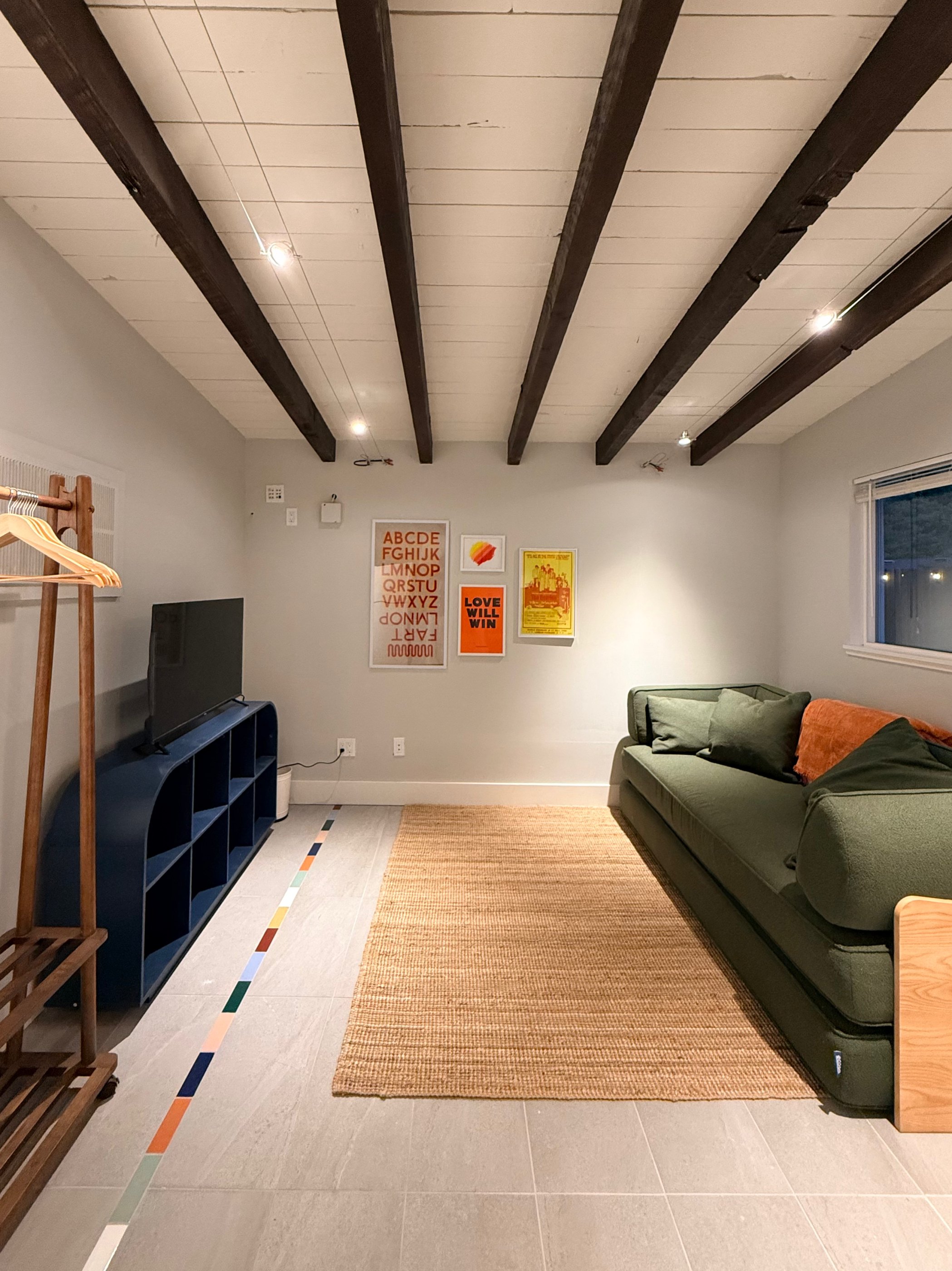
The forest house rec room with Gray Owl walls at full strength, dark wood ceiling beams, a green sofa and a jute rug
Full strength Gray Owl on the walls of the rec room at my forest house.

04

Gray Owl

Benjamin Moore OC-52, full strength or at 50%

Where I Use It

At 50%, on the walls of my San Francisco living room and kitchen. At full strength, on the walls of the rec room at my forest house. When I worked at Pinterest, I noticed the walls there were barely gray, almost white, too.

Why I Love It

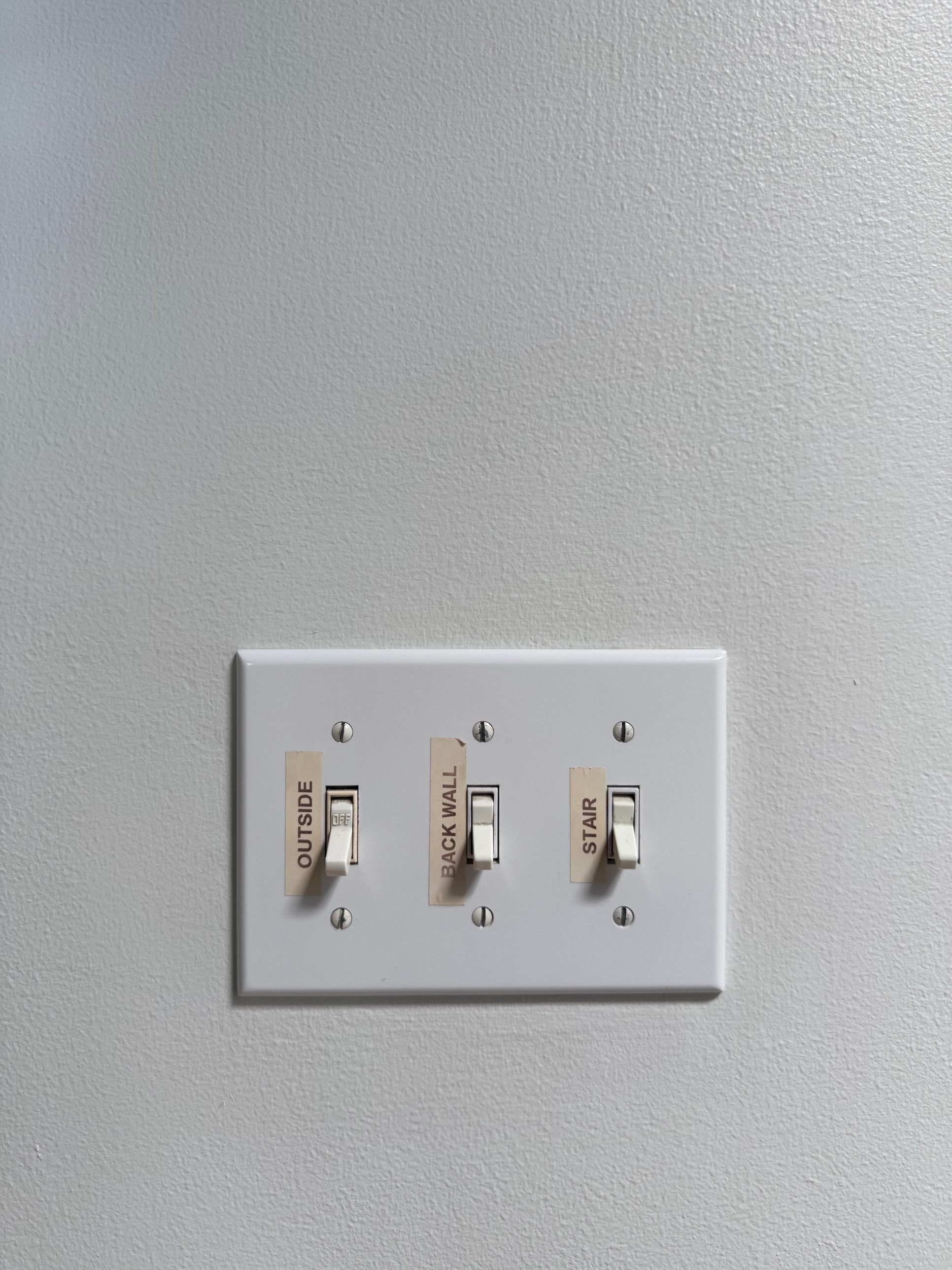
At half strength it reads as white, but it gives white trim and outlet covers something to pop against. In the rec room I went full strength because I wanted to create some dimensionality with the white ceiling and trim.

A white light switch plate on a wall painted Gray Owl at 50 percent
A white switch plate on Gray Owl at 50%.
White picture frames on a Gray Owl at 50 percent wall above a mustard French Horn arch
White frames against Gray Owl at 50%, above French Horn.

Pro Tip

You can ask the paint store for any color at 25%, 50%, or 75% strength. I do it all the time.

05, 06 and 07

Pink in the Bathroom

I love pink in bathrooms because it creates really flattering light for people of all skin tones. Greens and blues are popular for bathrooms but they can make people look washed out. And in feng shui, they say it's good to match the coolness of the water in a bathroom with warm shades.

Pink bathrooms three ways! I love living in them.

A San Francisco bathroom with Parchment walls, a coral ceiling and a navy-striped shower curtain
Parchment on the walls, under a Sherwin-Williams Coral Odyssey ceiling.

Parchment

Benjamin Moore OC-78

Neutral walls with a pink ceiling uplit casting a sunset glow on the whole room.

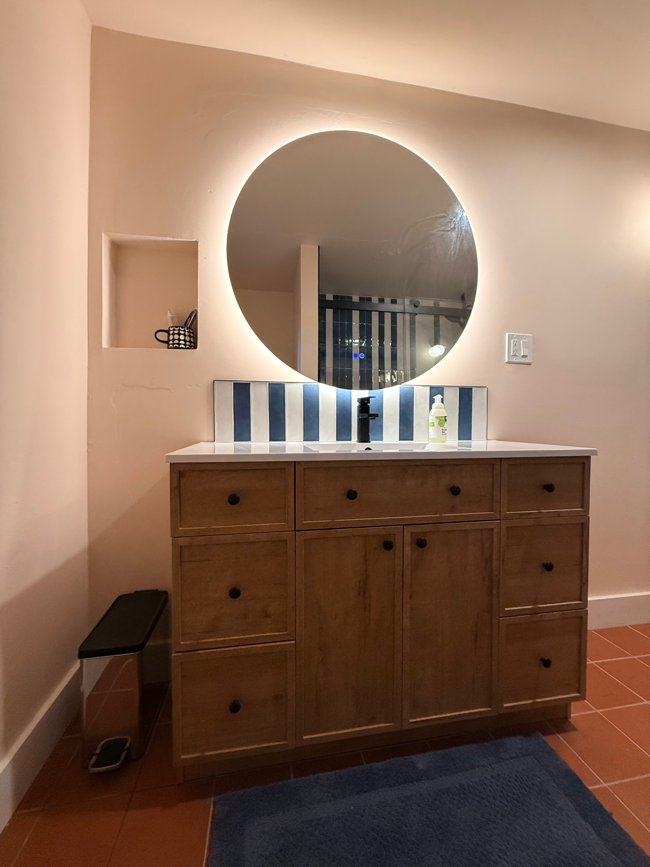
A bathroom painted Tissue Pink with a round lit mirror, a wood vanity, blue-and-white striped tile and a terracotta floor
Tissue Pink with terracotta floor tile, a wood vanity and blue-and-white striped tile.

Tissue Pink

Benjamin Moore 1163

A barely-there pink accented with classic blue and white.

A small forest house bathroom painted Vintage, with a round mirror and a dark wood vanity
Vintage, with a green accent for the mirror, and midcentury details.

Vintage

Benjamin Moore 1174

A dusty mid pink with enough gray in it not to feel overwhelming.

Three Tricks I Use All the Time

Ask for 50%

Any paint store can mix a color at half strength, or even 25% or 75%. It's how I get a wall that reads as white but still lets white trim stand out.

Use the Same Color in Two or More Shades

Pair a color with a darker version of itself, then add a third or even a fourth color. It gives a many-color palette cohesiveness and consistency. People can be scared to use more than a few colors, but this makes it work. You can see a version of it on the forest house bedroom beams.

Six columns of color blocks showing how Laura combined colors on six portrait cards, each with one dominant color, two supporting colors and a small accent
How I combined colors on a museum exhibit design for the Lawrence Hall of Science lobby.

Paint the Ceiling

These days, white ceilings feel a little bit out to me, unless the walls are white or gray. If I were painting my bedroom again, I'd do the ceiling in Hollingsworth Green too. Don't want to paint the ceiling? Go with gray or white walls, like the rec room at my forest house.

See Them in My Rooms

Laura's San Francisco living room with a dark Cheating Heart ceiling, Gray Owl at 50% walls and a mustard French Horn arch behind the TV

My San Francisco Home

Painted ceilings, a French Horn arch, and the story of the wrong yellow.

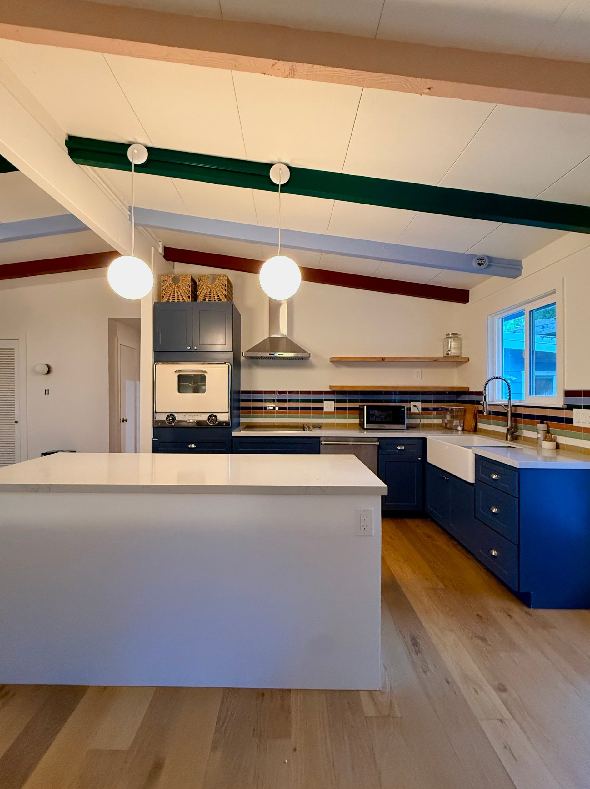
The forest house kitchen with Evening Dove cabinets, a striped tile backsplash and painted ceiling beams

The Forest House

Swiss Coffee walls, eight colorful beams and Evening Dove cabinets.

Need Help Choosing?

I'll help you find the right colors for your home or business.

Work with me

Color Catalog may earn a commission when you order samples through the links on this page.